
Web Design and Internet Marketing company based in Wausau, WI

Category: Tech

Why Countdown Timers Still Work for Online Conversions

Every website visitor makes decisions quickly. They scan a page, compare the offer, think about whether they need it now, and decide whether to take action or leave. For business owners, marketers, course creators, e-commerce stores, and WordPress website owners, that short window of attention matters. A clear offer can bring people closer to conversion, but urgency often helps them act faster.

Countdown timers are one of the simplest ways to create that urgency. They give visitors a visible reminder that an offer, sale, event, launch, or deadline will not last forever. When used properly, a timer can make a promotion feel more immediate without making the page look too aggressive.

The key is to use countdown timers with purpose. A timer should support a real campaign, not appear randomly on every page without reason. When the message, deadline, call to action, and design all work together, countdown timers can help guide visitors toward the next step.

For WordPress users, a flexible WordPress countdown timer plugin can make it easier to add urgency to pages, posts, landing pages, product pages, and promotional campaigns without rebuilding the entire website.

Urgency Helps Visitors Make Decisions

Many people delay decisions online. They may like a product but plan to come back later. They may be interested in a service but forget to contact the business. They may open a sales page but leave before clicking the button. This is normal behavior, especially when visitors are busy or comparing multiple options.

A countdown timer helps reduce that delay by creating a clear time-based reason to act. It tells the visitor that the offer has a deadline. This can be useful for flash sales, holiday promotions, event registrations, product launches, early-bird pricing, webinar signups, shipping cut-off reminders, and limited-time bonuses.

The timer does not need to pressure users unfairly. It simply makes the deadline visible. If the offer is real and the timer is used honestly, it can improve the page experience by making the timing clear.

Urgency works best when it supports a strong offer. A countdown timer cannot fix a weak product, unclear message, or confusing page. But when the offer is already valuable, the timer can help visitors move forward instead of waiting.

Countdown Timers Are Useful Beyond E-Commerce

Many people think countdown timers are only for online stores, but they can be used across many types of websites. E-commerce stores may use them for product discounts, cart promotions, seasonal sales, and shipping deadlines. But service businesses, coaches, agencies, course creators, nonprofits, event organizers, and membership sites can also benefit.

A consultant may use a timer for limited appointment availability. A course creator may use one for enrollment deadlines. A webinar host may use a timer before registration closes. A nonprofit may use one for a fundraising campaign. A local business may use a timer for a weekend promotion.

The purpose is always the same: make the deadline clear and visible.

Countdown timers can also help structure campaigns. Instead of simply saying “offer ends soon,” a timer shows exactly how much time remains. This removes confusion and makes the call to action stronger.

For WordPress website owners, being able to place timers in different parts of the site can make campaigns easier to manage.

Design Matters More Than Many People Think

A countdown timer should not look like an afterthought. If the design clashes with the website, it can reduce trust. Visitors may ignore it or feel that the page looks unprofessional. A good timer should match the website’s colors, typography, spacing, and overall style.

For example, a luxury brand may want a clean and minimal timer. A flash sale page may use bolder styling. A course launch page may need a professional layout that fits the rest of the sales page. A local business may want something simple and easy to read.

Design flexibility is important because every website is different. The timer should support the page, not distract from it. The numbers should be readable. The labels should be clear. The spacing should work on desktop and mobile. The call to action should be close enough that visitors know what to do next.

A timer that looks natural on the page is more likely to improve the campaign experience.

Mobile Responsiveness Is Essential

Many visitors browse websites from phones. If a countdown timer looks good on desktop but breaks on mobile, it can hurt the campaign. A timer may become too wide, too small, difficult to read, or poorly aligned. This can make the page feel unpolished.

A mobile-friendly countdown timer should adjust cleanly to smaller screens. The digits should remain readable. The labels should not overlap. The timer should not push important content too far down the page. It should support the user experience instead of creating frustration.

This matters even more for e-commerce stores and landing pages because mobile users often decide quickly. If the countdown timer makes the offer easier to understand, it can help. If it makes the page harder to use, it can reduce conversions.

Before launching a timer campaign, website owners should always check how it appears on mobile, tablet, and desktop.

Fixed Deadline Timers Work Well for Real Campaigns

A fixed deadline timer counts down to a specific date and time. This is useful for campaigns that have a true ending point. Examples include a Black Friday sale, a product launch, an event registration deadline, a webinar start time, or a seasonal promotion.

Fixed timers are easy for visitors to understand. Everyone sees the same deadline, and the campaign ends at the same time for all users. This makes them useful for public promotions and scheduled events.

The message around the timer should be clear. Visitors should know what ends when the timer reaches zero. Is the discount ending? Is registration closing? Is a product launching? Is a bonus disappearing? A countdown timer works best when the visitor understands exactly what is at stake.

A fixed deadline should be honest. If the timer resets every time someone visits, it can damage trust. Clear deadlines make the campaign feel more professional.

Evergreen Timers Can Support Automated Funnels

Evergreen timers work differently from fixed deadline timers. Instead of counting down to one public date, they create a personalized deadline for each visitor. This can be useful for automated funnels, email campaigns, limited-time bonuses, and personalized offers.

For example, a visitor may join an email list and receive a special offer that expires after 48 hours. An evergreen timer can show that deadline on the landing page. This creates urgency while still allowing the campaign to run automatically for each new visitor.

Evergreen timers are useful because many marketing campaigns do not happen on one fixed date. Businesses often want automated promotions that work continuously. A personalized timer helps create a deadline without requiring the campaign to be manually restarted.

However, evergreen timers must be handled carefully. The timing should be consistent and reliable. If visitors can refresh the page and reset the timer, the urgency loses credibility. A good setup should keep the deadline stable.

Expiry Actions Can Improve the Campaign Flow

What happens when a countdown timer ends is just as important as the timer itself. Some websites may want to hide the offer. Others may want to redirect visitors to another page. Some may want to replace the offer with a message. E-commerce stores may want to disable a button or remove a promotional section.

Expiry behavior helps make the campaign feel complete. If the timer reaches zero but the discount is still available, visitors may lose trust. If the page still shows an expired promotion, it can create confusion.

A planned expiry action keeps the website cleaner. It allows the business to decide what visitors should see after the deadline passes. This is useful for flash sales, limited-time coupons, product launches, event registrations, and seasonal campaigns.

Good countdown timer strategy is not only about showing time. It is about managing the full visitor experience before, during, and after the deadline.

WooCommerce Stores Can Use Timers to Highlight Offers

WooCommerce stores often rely on promotions to increase sales. Countdown timers can help highlight those offers. A timer can be placed on a product page, sale landing page, homepage banner, or checkout-related page depending on the campaign.

For example, a store may use a timer for a weekend sale, limited-stock campaign, bundle offer, free shipping deadline, or product launch. The timer helps shoppers understand that the offer is time-sensitive.

The best WooCommerce timer campaigns connect the timer with a clear call to action. If the timer says the sale ends soon, the product page should make it easy to buy. If the timer promotes free shipping before midnight, the cart or checkout experience should support that message.

Timers should not be overused. If every product always has a countdown, visitors may stop trusting them. They work best when connected to real promotions.

Shortcodes Make Timer Placement Flexible

WordPress users often need flexibility. Some want a timer inside a page. Others want it in a blog post, landing page, sidebar, product page, or custom layout. Shortcode placement makes this easier because the timer can be added wherever the shortcode is supported.

This is helpful for website owners who do not want to edit code. They can create the timer, copy the shortcode, and place it inside the content area. Developers and advanced users can also use shortcodes in custom templates or page builder sections.

Flexible placement is important because every campaign is different. A product launch may need a timer near the top of the page. A sale page may need one above the call to action. A blog promotion may place the timer inside the article. A sidebar timer may work for site-wide promotions.

The easier it is to place the timer, the faster a business can launch campaigns.

Countdown Timers Should Support the Call to Action

A countdown timer should always connect with the page’s main action. If visitors see a timer but do not know what to do next, the timer loses value. The call to action should be clear, visible, and connected to the deadline.

For an e-commerce page, the action may be “Buy Now” or “Add to Cart.” For a course launch, it may be “Enroll Today.” For a webinar, it may be “Reserve Your Seat.” For a service business, it may be “Book a Consultation.” The timer should support that action.

Placement matters. If the timer is too far away from the button, the urgency may not connect with the conversion step. If the timer is too large or distracting, it may overwhelm the page. A balanced layout helps the timer and call to action work together.

The best timer campaigns feel intentional. The message, design, deadline, and button all support one goal.

Testing Helps Improve Timer Performance

Countdown timers should be tested like any other conversion element. Website owners can try different placements, styles, messages, and deadlines to see what works best. A timer near the headline may perform differently from one near the pricing section. A simple design may work better than a bold design depending on the audience.

Testing does not need to be complicated. Businesses can start by comparing campaign results before and after adding a timer. They can also review clicks, purchases, signups, form submissions, and bounce rates. If the timer improves action without hurting trust, it may be a good fit.

The wording around the timer can also make a difference. “Sale ends in” feels different from “Enrollment closes in” or “Bonus expires in.” The message should match the campaign.

Small improvements can make a big difference when the page already receives regular traffic.

EZ Countdown Timer Helps Turn Deadlines Into Action

A countdown timer is simple, but it can support many different marketing goals. It can help create urgency, explain deadlines, promote offers, support launches, and guide visitors toward action. For WordPress users, the right tool makes it easier to create timers without adding unnecessary complexity.

EZ Countdown Timer gives website owners a practical way to add countdown timers to campaigns, customize the design, and use timers across different WordPress pages. Whether the goal is to promote a flash sale, prepare for a launch, support WooCommerce offers, or create urgency around a limited-time campaign, a timer can make the deadline more visible.

The most effective countdown timers are honest, clear, and well-designed. They support real offers and help visitors understand when action is needed.

When used properly, countdown timers do more than show time. They help turn attention into action and make marketing campaigns feel more focused, timely, and conversion-ready.


Calgary Businesses Are Rethinking IT Support

If you walk into any office in Calgary these days, you’ll notice one thing: technology isn’t just a tool anymore—it’s the backbone of how businesses operate. From small startups to established firms, companies are realizing that having a reactive “wait until it breaks” IT approach is no longer enough. That’s where The ITeam comes in, offering proactive IT support that keeps operations running smoothly while letting business leaders focus on what they do best.

Staying Ahead of Problems Before They Happen

Downtime is more than just inconvenient—it can cost a company thousands of dollars in lost productivity, missed opportunities, and frustrated clients. More Calgary businesses are moving away from patchwork, break-fix solutions, and investing in managed IT services.

With The ITeam, systems are monitored continuously, issues are flagged early, and updates are handled before they become critical. Staff can work confidently without unexpected interruptions, and leadership teams can concentrate on growth rather than firefighting technical glitches.

Security That Doesn’t Complicate Work

Cybersecurity threats aren’t slowing down—they’re evolving every day. Companies need more than basic antivirus software to protect sensitive data. From ransomware to phishing attacks, the stakes are high.

The ITeam takes a layered approach to security, combining risk assessments, employee training, secure backups, and advanced monitoring. Calgary businesses working with The ITeam can trust that their data is protected, their compliance obligations are met, and their clients’ trust remains intact.

Making Remote Work Work

Remote and hybrid work arrangements are now part of daily life for many Calgary companies. But flexible work comes with challenges—secure access, reliable connectivity, and device management all need careful handling.

By implementing cloud tools, VPN access, and scalable IT strategies, The ITeam ensures employees can work efficiently from anywhere. Productivity and security aren’t mutually exclusive; with the right support, they go hand in hand.

Local Expertise, Personal Touch

There’s something to be said for working with a team that understands your city and your business environment. The ITeam doesn’t offer generic, one-size-fits-all solutions. Instead, they take the time to learn how each business operates, tailoring strategies to fit unique needs.

From professional services to firms with complex data requirements, Calgary organizations benefit from IT strategies that enhance efficiency rather than slow them down. The human touch makes a real difference.

Reducing Stress, Controlling Costs

Managing IT internally can be overwhelming, especially for small teams. Outsourcing to a managed service provider like The ITeam not only relieves pressure but also ensures expert guidance is always on hand. Predictable monthly pricing helps businesses budget confidently while reducing the costs of emergency repairs and unexpected downtime.

Businesses curious about modern IT solutions can explore what The ITeam offers at https://theiteam.ca/, seeing firsthand how proactive support transforms day-to-day operations.

Building Trust Through Clear Communication

Technology can be intimidating, but The ITeam prides itself on clear, approachable communication. Clients don’t just get a service—they gain a partner who explains things plainly, provides guidance when needed, and helps teams make informed decisions.

For Calgary businesses looking to thrive in a competitive digital environment, partnering with The ITeam means more than just IT support—it’s about stability, confidence, and long-term growth. Learn more at https://theiteam.ca/ and see why so many local companies trust The ITeam to keep their operations secure and efficient.

Best ai tool for logo

Best AI Tools for Logo Design: Top Platforms to Create Stunning Logos

Best AI Tools for Logo Design: Top Platforms to Create Stunning Logos

Creating a professional and visually appealing logo is essential for any business, brand, or personal project. Thanks to artificial intelligence, designing a logo has become easier, faster, and more affordable than ever. AI-powered logo design tools help users generate high-quality logos without the need for advanced graphic design skills.

In this article, we’ll explore the best AI tools for logo design, highlighting their features, pros, and cons to help you choose the right one for your needs.

1. What to Look for in an AI Logo Design Tool

Before choosing an AI-powered logo maker, consider the following key features:

  • Ease of Use: The tool should have a user-friendly interface and require minimal design experience.
  • Customization Options: It should allow you to tweak fonts, colors, and layout.
  • Quality of AI Suggestions: The AI should generate unique and professional-looking logos.
  • File Formats: Look for tools that provide high-resolution files in PNG, SVG, and vector formats.
  • Pricing: Check if the tool is free, offers one-time purchases, or requires a subscription.

2. Best AI Tools for Logo Design

2.1. Looka

Best for: Startups and small businesses that need a professional-looking logo quickly.

Looka is an AI-powered logo maker that generates custom logo designs based on your brand preferences. Simply enter your business name, choose a few styles you like, and the AI will create a variety of logos to choose from.

  • Pros: High-quality designs, brand kit included, easy customization.
  • Cons: Requires payment to download the logo.

2.2. Hatchful by Shopify

Best for: Entrepreneurs and e-commerce store owners.

Hatchful is a free AI logo maker from Shopify that provides ready-to-use logo templates. It’s perfect for new business owners who need a quick and stylish logo.

  • Pros: Free to use, ideal for startups, includes social media assets.
  • Cons: Limited customization options.

2.3. LogoMakr

Best for: DIY designers who want hands-on control.

LogoMakr combines AI-generated designs with a drag-and-drop editor, allowing for more flexibility in logo creation.

  • Pros: Free basic downloads, easy customization.
  • Cons: High-resolution files require payment.

2.4. Tailor Brands

Best for: Businesses that need a complete branding package.

Tailor Brands is more than just a logo maker—it provides full branding solutions, including business cards, social media assets, and websites.

  • Pros: AI-powered design suggestions, complete brand identity kit.
  • Cons: Requires a subscription for access to full features.

2.5. DesignEvo

Best for: Beginners who need a simple and free logo maker.

DesignEvo offers thousands of pre-designed logo templates and AI-generated designs for quick customization.

  • Pros: Free for basic downloads, vast template collection.
  • Cons: High-quality files require payment.

2.6. BrandCrowd

Best for: Businesses that want high-quality logo templates.

BrandCrowd offers premium logo designs powered by AI, along with branding tools for social media and marketing.

  • Pros: Large selection of professional designs, customization tools.
  • Cons: Higher cost compared to other AI logo makers.

2.7. Canva Logo Maker

Best for: Users who want both AI-powered and manual design capabilities.

Canva is a versatile design platform that includes an AI-powered logo generator along with extensive customization tools.

  • Pros: Free templates, drag-and-drop editing, multiple file formats.
  • Cons: Advanced features require a Canva Pro subscription.

3. Choosing the Right AI Logo Maker for Your Needs

Each AI logo design tool has its strengths, so the best choice depends on your specific requirements:

  • For a free and quick logo: Use Hatchful or DesignEvo.
  • For a highly customizable logo: Try Looka, Canva, or LogoMakr.
  • For branding packages: Tailor Brands or BrandCrowd are ideal.
  • For e-commerce businesses: Looka and Hatchful are great choices.

4. Conclusion

AI-powered logo design tools have revolutionized the way businesses and individuals create their branding. Whether you’re launching a startup, running an online store, or rebranding your business, these AI tools offer fast, cost-effective, and professional solutions. By selecting the right AI logo maker based on your needs, you can build a strong brand identity in just minutes.

Website builders

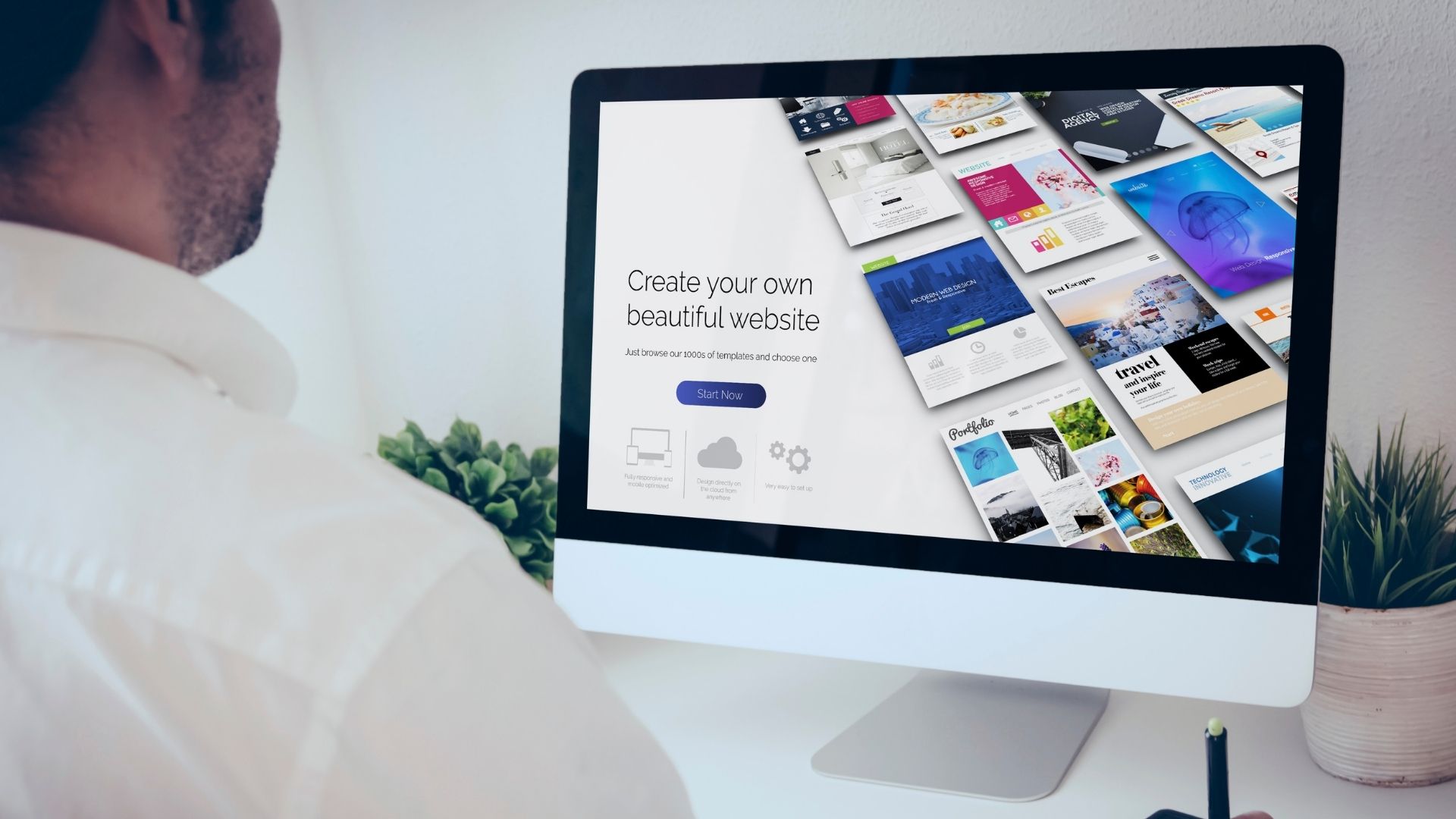
Best Website Builders for Photographers: Top Platforms to Showcase Your Work

Best Website Builders for Photographers: Top Platforms to Showcase Your Work

As a photographer, having an online presence is essential for showcasing your work and attracting new clients. The best website builders for photographers offer beautiful templates, easy customization, and powerful tools for image galleries and SEO. In this article, we’ll explore the top website builders that can help photographers create stunning portfolios.

1. What to Look for in a Website Builder for Photographers

Before choosing a website builder, consider these key features:

  • High-Quality Image Display: Your website should showcase your work in full resolution with fast loading speeds.
  • Customizable Templates: A good website builder should offer professional, photography-focused templates.
  • SEO Tools: Features that help your site rank higher in search engines.
  • E-Commerce Capabilities: If you plan to sell prints or services, ensure the platform supports online sales.
  • Mobile Responsiveness: Your website should look great on all devices.
  • Easy Navigation: A user-friendly interface ensures a seamless experience for visitors.

2. Best Website Builders for Photographers

2.1. Squarespace

Best for: Professional photographers who want elegant templates and built-in e-commerce.

Squarespace is one of the most popular website builders for photographers, offering stunning, minimalist templates designed to highlight visual content.

  • Pros: Beautiful photography templates, easy-to-use interface, e-commerce features.
  • Cons: Slightly limited customization options compared to other platforms.

2.2. Wix

Best for: Photographers who want full customization with a drag-and-drop editor.

Wix is known for its flexibility, offering over 800 templates, many of which are designed specifically for photographers.

  • Pros: Highly customizable, AI-powered design assistance, built-in SEO tools.
  • Cons: Free plan has ads, templates cannot be switched after selection.

2.3. SmugMug

Best for: Photographers looking to sell prints and deliver digital images directly to clients.

SmugMug is a photography-focused website builder with integrated e-commerce features for selling photos and prints.

  • Pros: Unlimited photo storage, built-in online store, professional-grade galleries.
  • Cons: Less customization compared to Wix or Squarespace.

2.4. Zenfolio

Best for: Professional photographers who need portfolio hosting and online sales.

Zenfolio offers an all-in-one platform for showcasing, managing, and selling photography work.

  • Pros: Great e-commerce tools, high-quality photo galleries, automated client fulfillment.
  • Cons: The design interface can feel a bit outdated.

2.5. Format

Best for: Minimalist photography portfolios with a professional look.

Format is designed for photographers who want a clean and simple online portfolio.

  • Pros: Sleek templates, password-protected galleries, easy-to-use interface.
  • Cons: Limited e-commerce capabilities compared to SmugMug or Zenfolio.

2.6. WordPress + Elementor

Best for: Photographers who want full control over design and functionality.

WordPress with Elementor allows you to create a fully customized photography website with endless design possibilities.

  • Pros: Highly customizable, thousands of plugins, great for SEO.
  • Cons: Requires more technical knowledge than drag-and-drop builders.

3. Choosing the Right Website Builder for Your Photography Business

The best website builder for photographers depends on your needs:

  • If you want the best-designed templates, Squarespace is the top choice.
  • If you need full customization, Wix or WordPress is the way to go.
  • If selling prints is your main goal, consider SmugMug or Zenfolio.
  • If you want a minimalist portfolio, Format is a great option.

4. Conclusion

Building a photography website is an essential step in growing your brand and attracting clients. The best website builders for photographers offer beautiful templates, easy customization, and powerful tools to showcase your work. Whether you’re looking for a simple portfolio or an advanced e-commerce solution, there’s a platform to suit your needs.

Understanding Parallax Error: An In-Depth Exploration

Parallax error is a common issue in measurements and observations that can lead to inaccuracies. It occurs when the position or direction of an object is viewed from different angles, causing a discrepancy in the perceived location or value. This article provides a comprehensive analysis of parallax error, exploring its causes, effects, and strategies for minimizing its impact.

What is Parallax Error?

Parallax error arises when the position of an object appears different when viewed from various perspectives. This shift is due to the observer’s line of sight being at an angle relative to the object. In practical terms, it means that measurements or observations can vary based on the viewing angle, leading to potential inaccuracies.

Causes of Parallax Error

Several factors contribute to parallax error. Understanding these causes can help in identifying and mitigating the issue:

  • Viewing Angle: The primary cause is the angle at which an observer views an object. When the observer’s line of sight is not perpendicular to the object, parallax error occurs.
  • Instrument Design: Instruments such as rulers, measuring tapes, or telescopes can introduce parallax error if their scales are not aligned properly with the observer’s line of sight.
  • Observer Position: Variations in the observer’s position relative to the object can also lead to parallax error, especially if the object is far from the observer.
  • Scale Markings: Inaccuracies can arise from misalignment of scale markings on measuring instruments, further exacerbating parallax error.

Effects of Parallax Error

Parallax error can have significant effects across various fields, including scientific measurements, astronomy, and everyday observations:

  • Scientific Measurements: Inaccurate measurements due to parallax error can affect the reliability of experimental data and results.
  • Astronomy: Parallax error can impact the accuracy of celestial observations and distance measurements, affecting astronomical calculations.
  • Everyday Observations: In daily tasks, such as reading a scale or using an analog instrument, parallax error can lead to incorrect readings and judgments.

Minimizing Parallax Error

Several strategies can help reduce or eliminate parallax error in various contexts:

1. Aligning the Line of Sight

Ensuring that the observer’s line of sight is perpendicular to the measurement scale or object can minimize parallax error:

  • Positioning: Adjust your position to view the object or measurement from directly above or at a perpendicular angle.
  • Use of Tools: Instruments with built-in alignment features can help in achieving a consistent line of sight.

2. Using Parallax-Free Instruments

Parallax-free instruments are designed to minimize or eliminate the effects of parallax error:

  • Digital Instruments: Many digital measuring tools are less susceptible to parallax error due to their electronic display.
  • Optical Instruments: Telescopes and microscopes with built-in alignment features reduce parallax error by providing clear and direct measurements.

3. Calibration and Adjustment

Regular calibration and adjustment of instruments can help reduce parallax error:

  • Calibration: Ensure that instruments are calibrated according to manufacturer specifications to maintain accuracy.
  • Adjustment: Regularly check and adjust scale markings and alignment to prevent parallax error.

4. Cross-Verification

Using multiple methods or instruments to cross-verify measurements can help identify and correct parallax error:

  • Multiple Readings: Take multiple measurements from different angles and compare them to identify discrepancies caused by parallax error.
  • Alternative Tools: Use different instruments to cross-check measurements and ensure consistency.

Additional Resources

For more detailed information on parallax error and measurement accuracy, visit Dwyer. This resource provides valuable insights into scientific measurement techniques and error minimization strategies.

Understanding and addressing parallax error is crucial for accurate measurements and observations. By following the strategies outlined above, you can reduce the impact of parallax error and enhance the reliability of your results.

Powered by WordPress & Theme by Anders Norén